Monday, October 3, 2011

Design Development |10

Phase Three


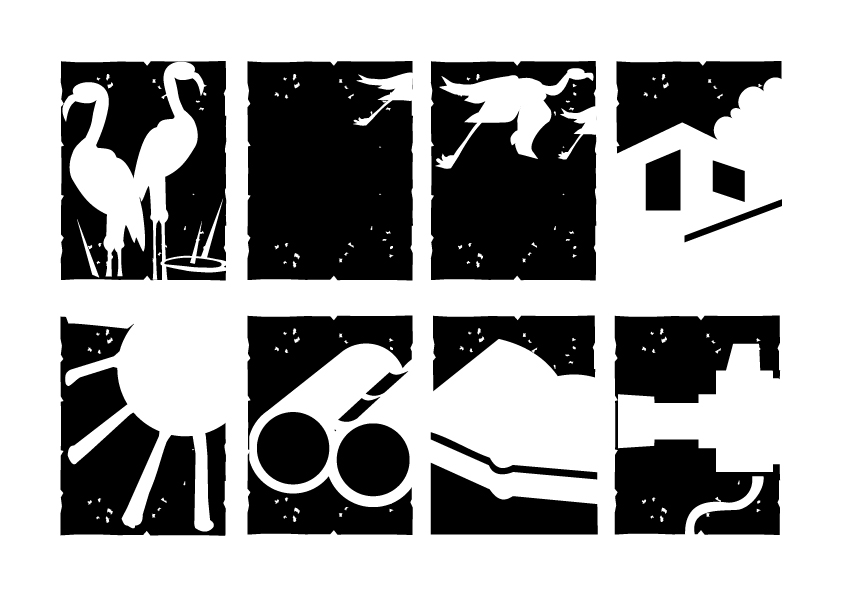
The maps designed for the information guide.


• This is the first map designed for the first page, which guides the user from the nearest airport (Ahmedabad) to Nalsarovar.


• The second manp has a colour pallet of the rainbow, as it has 8 routes and it is easier for the people to distinguish between such colours easily. I have added black as the 8th colour, as that route is the shortest and the most taken route.


Friday, September 30, 2011

Design Development |9

Phase Three
The sketch layout rough on actual size paper.


Design Development |8
Phase Three
 
Nalsarovar requires a lot of wayfinding. I took the decision of making signage motifs and incorporate them in my design. These motives would be then proposed to be installed at the site, where people would find it easy to connect with the site and the information handout. This would in turn make the experience more memorable and joyful.
 
 
• Some graphic elements  to be incorporated :


Design Development | 7
Phase Three
 
First Mock Up


Design Development |6
Phase Three
Type decisions were made and I decided that a seriff type would be the most  appropriate for the subject. I did various variations and saw that a heirarchy was not well maintained. Further, when I discussed this issue with my guide, he advised me to go for a sans seriff type, where the heirarchy culd be maintained by the vastness of the family and also a sans serif would be a better option than a seriff as the subject is not to formal or copy heavy.
We narrowed down to types in seriff like, Goudy, Baskerville, Times where Baskerville was my first preference and Sans seriff types like Meta, Universe, Helvetica. At the end, Meta was considered to be the most apt type, which was used to design the project.

Thursday, September 29, 2011

Design Development | 5
Phase Three
I considered the  concept - 3 to be my final deliverable and then started to make alterations in folds and sizes so as to get least paper wastage get the best outcome out of the design.


Saturday, August 13, 2011

Design Development | 4
Phase Three

After Compiling my research, decided to come up with alternative design concepts :

CONCEPT - 1


POSTER WITH A KIT

• A binocular

• A poster

Advantages

• Interactive

• Reusable

• Ambient

Disadvantages

• Limited information

• Handling problem

• Cost problem


CONCEPT - 2


Booklet with poster

• Poster on centre spread

Advantages

• Simple

• More information

• Advantage of a poster

Disadvantages

• Can become boring

• Cliché


CONCEPT - 3


Brochure with poster


• Poster on one side

Advantages

• Simple

• More information

• Advantage of a poster

• Scenario building

• Can act as a ticket

• Ergonomic

Disadvantages

• Handling